
Themes
Este conteúdo não está disponível em sua língua ainda.
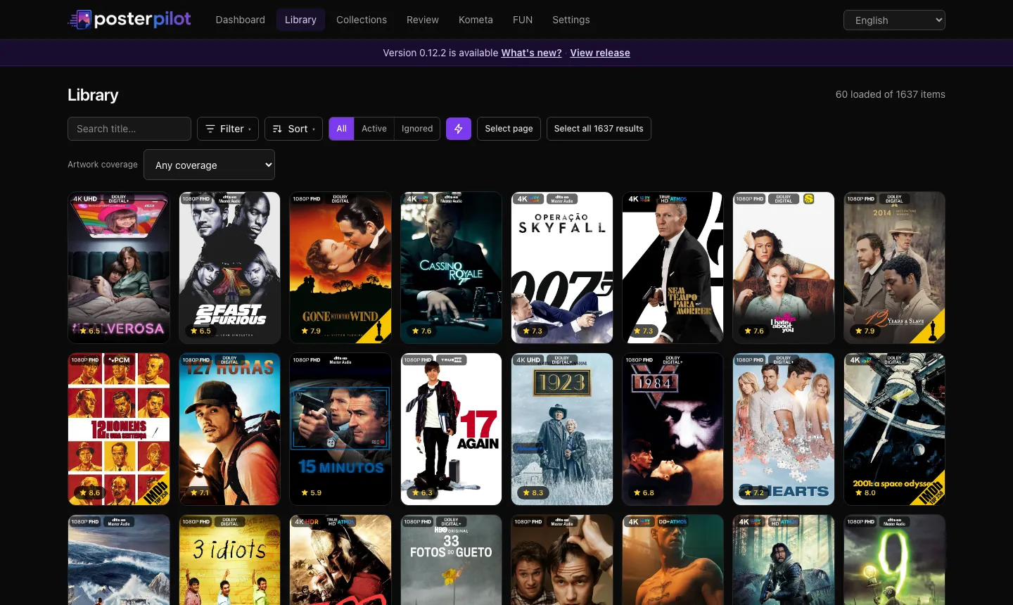
PosterPilot is dark and violet by default because darkness makes artwork pop. It is not stuck that way. Settings → Appearance carries eleven built-in themes, per-theme customization, and a theme-kit engine that user-authored themes ride too.
A theme here is data, not a stylesheet fork: a complete token set (background, surfaces, text, borders, accent ramp, radius, font, chrome) plus a descriptor saying which of its properties you are allowed to override. One resolver merges the theme with your overrides; one applier writes the result onto the page during server rendering, so the first paint already matches — no flash of the default.
How far a theme can go
Section titled “How far a theme can go”Most theming stops at recoloring. Three of the built-ins exist to show that this one does not: they change shape and affordance, not just palette. Read them as the reference for what a theme is allowed to do.
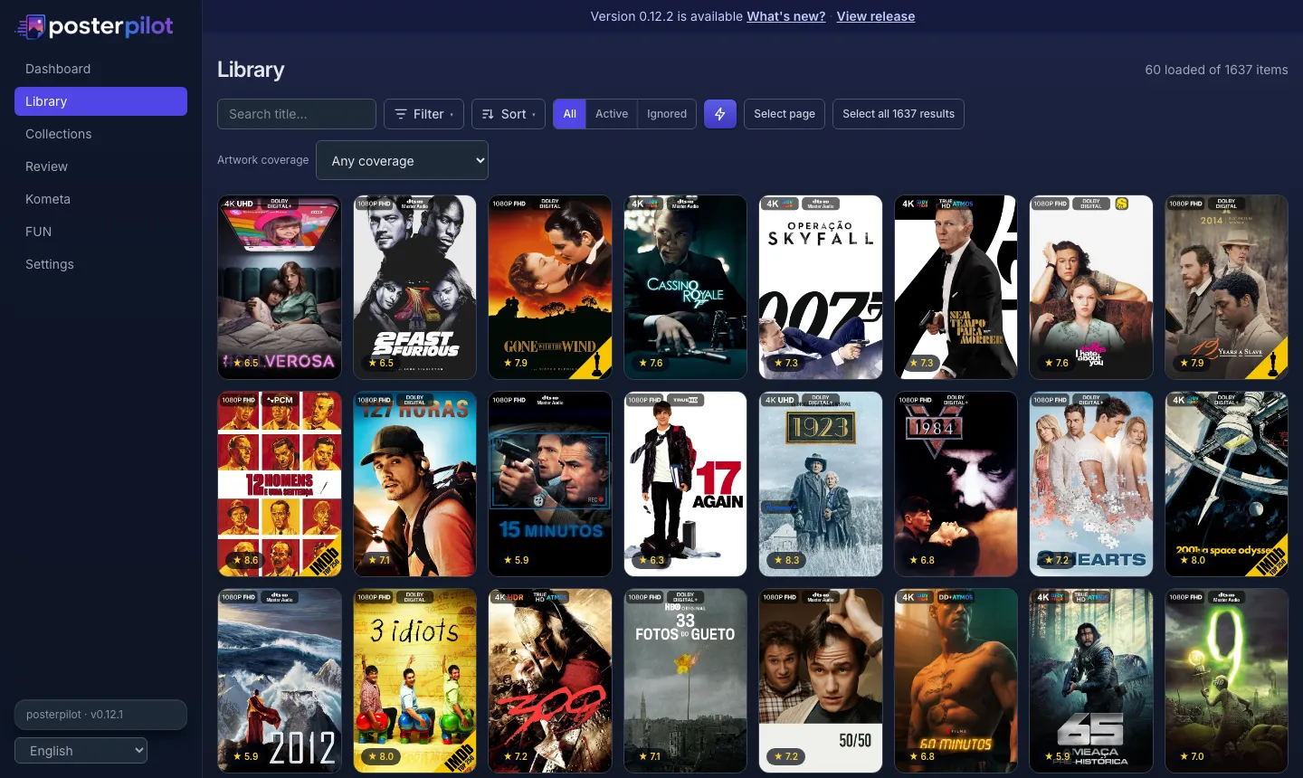
Overseerr
Section titled “Overseerr”Sidebar chrome with an indigo backdrop wash, cards that float on real shadows with a lit top edge, and a gradient primary button.
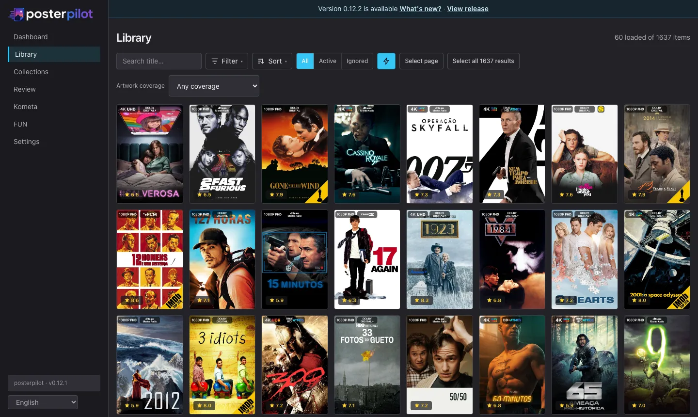
Sonarr/Radarr
Section titled “Sonarr/Radarr”Flat and dense. No shadows, no translucency, near-square 4px corners, buttons as outlined rectangles, and the active sidebar row marked by a left accent bar rather than a filled pill.
Terminal
Section titled “Terminal”A TUI that happens to run in a browser: monospace throughout, zero radius, phosphor palette, CRT scanlines, a caret blinking after the wordmark and a block cursor on the active route. Nothing is a pill.
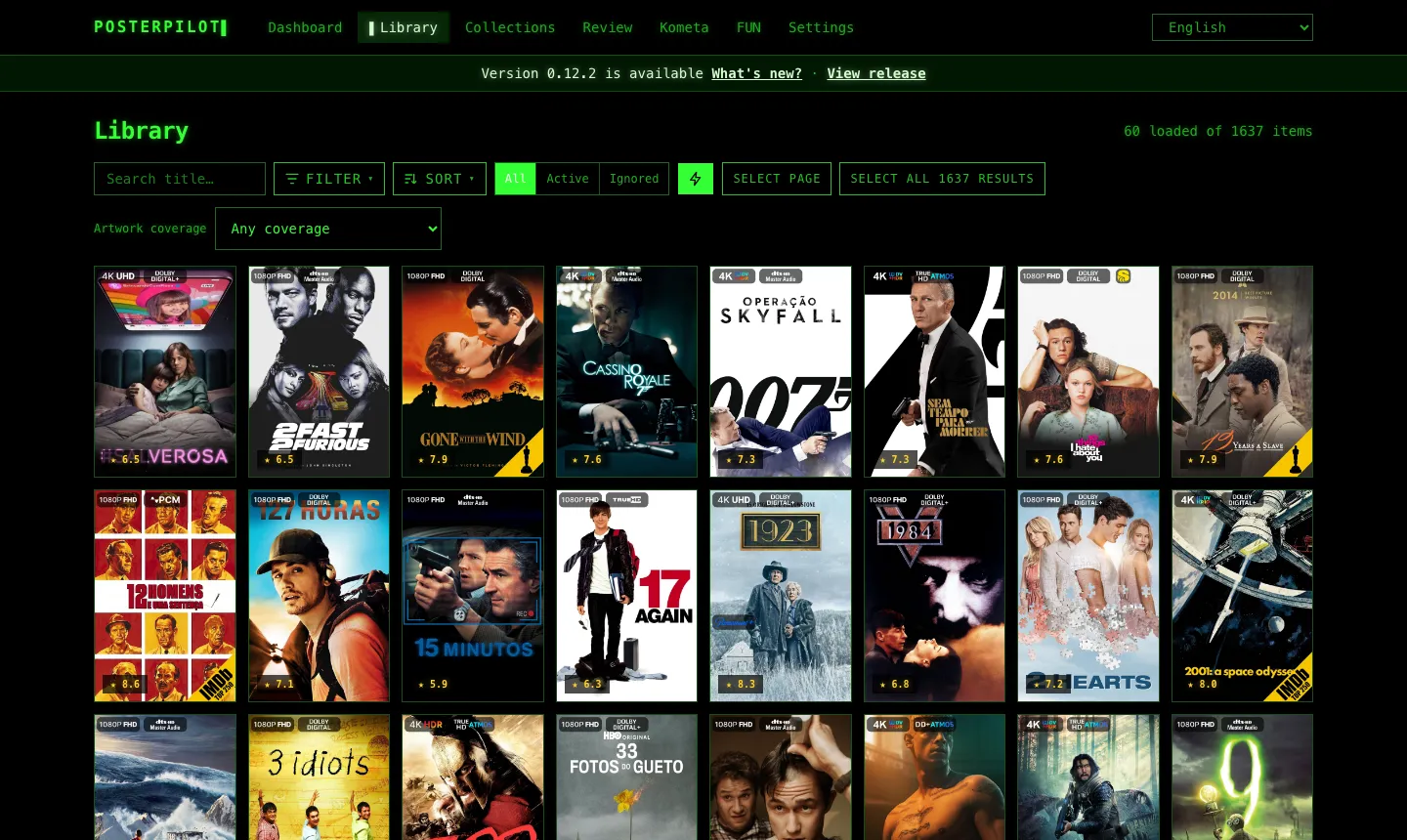
Each of these is a handful of CSS rules scoped to the theme, layered on top of its tokens. A theme you write yourself gets the same reach — see Shipping CSS with a theme.
The full set
Section titled “The full set”Base themes — PosterPilot (default), Darcula, Monokai, Catppuccin Mocha, and White.
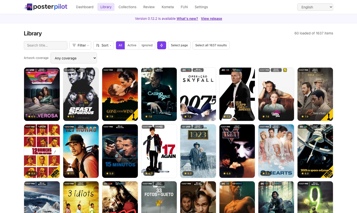
White is the light one. It inverts the accent stops used as text so they stay readable on white, swaps to the dark wordmark, and keeps dialog backdrops dark — a light theme still needs a dark scrim to separate a dialog from the page.
Extreme themes — Overseerr, Sonarr/Radarr, Terminal, and three Terminal palettes: Gruvbox, Nord, and Solarized.
The three palettes are worth a note, because they are the engine arguing for
itself. Each one is data — a name and a list of colors — that renders under
Terminal’s data-theme. They inherit the entire TUI reskin (monospace, zero
radius, scanlines, phosphor bloom, block cursor) without repeating a line of it,
which is exactly the mechanism a theme you author uses to extend a base. Adding a
fourth palette is a dozen lines of color, not a new stylesheet.
Every shipped theme is held to WCAG AA contrast (4.5:1 for text against both the theme background and its surfaces) by an automated check that reads the themes straight out of the stylesheet. A theme cannot ship below that floor.
Customizing a theme
Section titled “Customizing a theme”Each theme declares what it accepts. The Appearance panel shows only the controls the active theme allows, so you never set something the theme will discard:
| Override | Notes |
|---|---|
| Accent color | Repaints the whole ramp — buttons, active states, focus rings |
| Background color | Locked by White and Terminal; the background is their identity |
| Background image | A URL, drawn behind the chrome with an adjustable dim overlay |
| Corner radius | Locked by Terminal, whose zero radius is the point |
Overrides sit on top of the theme, reset back to it, and survive switching themes — they reapply wherever the new theme accepts them.
Two conveniences worth knowing:
- The accent foreground is re-derived from the accent you pick, so a pale accent flips the button text to black instead of leaving it unreadable white.
- Themes that reskin around a sidebar force that layout, and the navigation placement control says so rather than accepting a click it would discard.
Authoring your own
Section titled “Authoring your own”Save current as theme… turns the appearance you have built into a named custom theme with author, URL, version, and description. It extends a built-in base, so anything you do not override comes from that base and keeps working.
Custom themes appear in the picker beside the built-ins and can be updated, deleted, and exported.
Sharing a theme
Section titled “Sharing a theme”Export writes a .posterpilot-theme.json file:
{ "format": "posterpilot-theme", "formatVersion": 1, "theme": { "name": "Nebula", "author": "you", "version": "1.0.0", "base": "catppuccin", "tokens": { "accent-base": "#ff79c6", "surface": "#282a36", "radius": "0.5rem" } }}Import validates it wholesale: every token key must be one the engine knows and every value must match a strict per-key grammar. A file that fails is rejected with a reason and nothing is partially applied.
Editing the tokens object by hand is worth knowing about — the Appearance
controls expose the few properties most people want, while the file format
carries the whole token set (individual text stops, borders, surfaces, chrome,
font stack).
Shipping CSS with a theme
Section titled “Shipping CSS with a theme”A theme may carry a css field, applied while that theme is active and before
your own custom CSS. This is what the extreme themes use, and it is where a
theme stops being a palette:
{ "css": "[data-theme='catppuccin'] .badge { border-radius: 0 }"}Because a theme file travels between people, its CSS is held to stricter rules than the CSS you write into your own instance:
- No
@importand no remoteurl(). A downloaded theme must not fetch stylesheets, fonts, or images from another host. Local (/logo.png) and inline (data:) references are fine. - Importing a theme that ships CSS asks first, showing how much there is. Theme CSS restyles every page, so it is disclosed rather than applied silently.
- Your own custom CSS is not bundled unless you tick the box. What you write in the Custom CSS field stays on your instance by default.
An active custom theme’s CSS is editable in its own field in Appearance, separate from the instance-wide Custom CSS box below it — so an imported theme’s rules can actually be read, and edits save to the theme rather than to your settings.
Custom CSS
Section titled “Custom CSS”Independently of themes, the Custom CSS field applies verbatim as the last stylesheet on every page, after the active theme and all overrides. It is a deliberate escape hatch on a self-hosted, single-user app: nothing is validated beyond a size cap, and the browser ignores whatever does not parse.
Target the semantic tokens rather than raw colors so your rules survive a theme switch:
.surface { border-width: 2px;}.badge-mediux { background-color: var(--pp-accent-700);}PosterPilot is an independent project, not affiliated with or endorsed by Plex, Jellyfin, Emby, MediUX, Fanart.tv, TMDB, ThePosterDB, or Kometa. Trademarks belong to their respective owners. This product uses the TMDB API but is not endorsed or certified by TMDB.